
Printing errors and flaws
Svensk text av Mikael Carlsson.
English text by Jack Preuveneers.
Märket trycktes med en plåt bestånde av 100 lösa klicheer i två uppsättningar. Många av de minst 200 olika klicheerna har inviduella fel, vissa mer markanta än andra.
De två mest kända klicheefelen på 3 skilling är ”Dödskallen” och ”TOE”, men flera andra minst lika tydliga och intressanta klicheefel finns.
The stamp was printed with one plate of 100 movable clichés at a time and two alternating printing plates. Many of the at least 200 different clichés have individual flaws. Some are more prominent than others.
The two most famous flaws are ”the Skull”, by far the most dramatic flaw, and ”TOE” which owns its reputation to the strip-of-three.
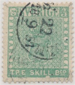
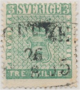
Dödskallen har suttit som pos 55 i en av de två plåtuppsättningarna.
Ett sandkorn har fastnat i klicheen som deformerat övre vänstra 3:a till den dödskalle. Dessutom har klicheen alltid en tydlig vit inbuktning under LL i SKILL.
Man benämner ibland dödskallen som tidig eller sen (tydligare) men detta har mest troligt mer med trycket att göra, mjuk (tät botten) respektive hård (klarare botten) däckel.
Den är okänd på c-nyanser vilket mest troligt beror på att man bytat ut klicheen efter första tryckleveransen.
The Skull is found in position 55 in one of the two printing-plates.
A grain has got permanently stuck to the left 3 and deforming it to look like a skull. This cliché also always have an indent on the lower margin under LL in SKILL.
The plate-flaw is sometimes described as early or late (clearer) with regards to the printing but this is most likely due to the pressure used, soft / dense background (”early”) or hard / clearer background (”late”).
The flaw is not known on c-shades which means the cliché was most likely replaced after the 1st printing.
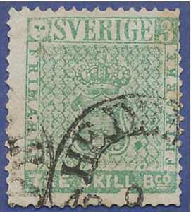
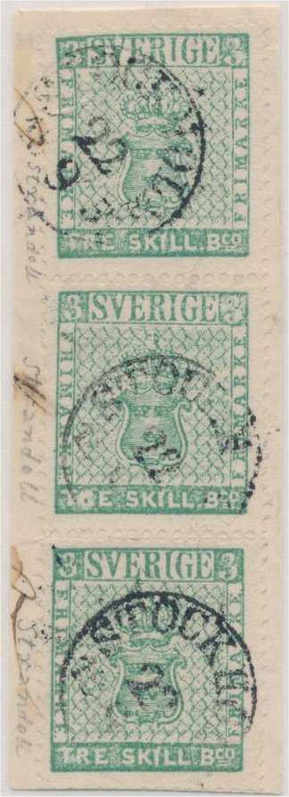
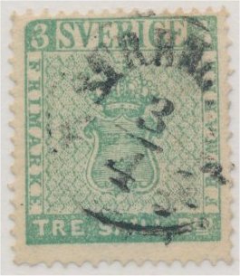
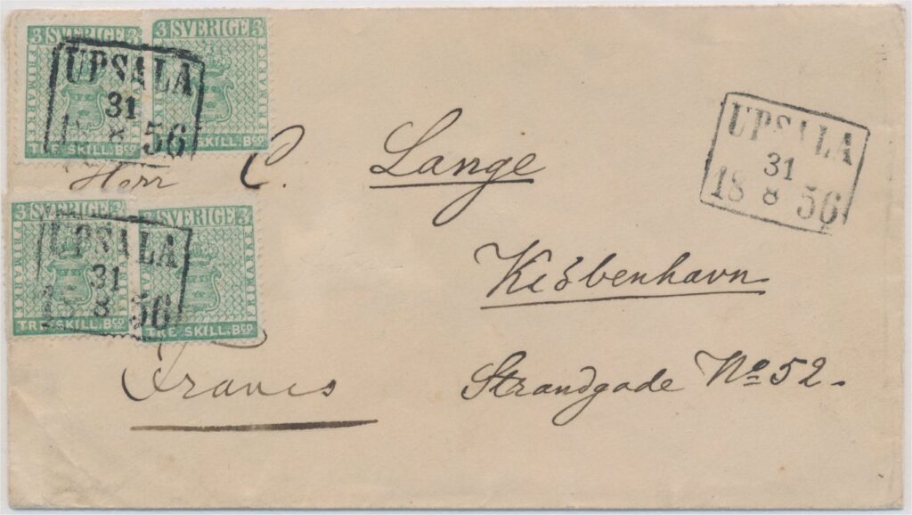
TOE finns i pos 64 i en av tryckplåtarna.
Detta klicheefel är mest känt p.g.a. 3-stripet nedan. Det är ett av de mer kända 3 skilling objekten, ofta avbildat i litteratur. Positionerna är 54 – 64 (TOE) – 74.
TOE is found in position 64 in only one of the two printing-plates.
The flaw is well known due to the strip-of-three above. One of the most famous 3 skilling objects, often pictured in literature. The positions are 54 – 64 (TOE) – 74.
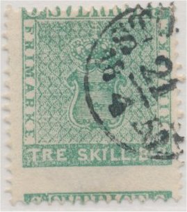
BEOS från position 81 är ett lika tydligt klicheefel som TOE.
R i TRE SKILL är deformerat och tillsammans med fläcken mellan E och S kan man utläsa BEOS.
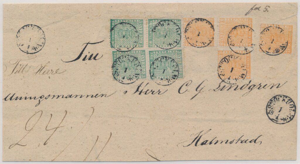
44 skilling inrikes porto (brevframsida) frankerad med 4x 8 skilling och 4x 3 skilling (a-nyanser) där övre högra 3 skillingen är BEOS. Brevet var i 24:e viktklassen med Postverket hade ett rabattsystem för viktklasser från den 8:e och avsändaren behövde endast betala för 11 viktklasser (11×4 skilling). Varje viktklass ökade med 1 lod, vilket innebär att brevet vägde 24 lod = 312 gram. Detta unika objekt är det högsta kända inrikesportot frankerat med skillingar.
BEOS from position 81 is just as clear as TOE.
R in TRE SKILL is deformed and together with the color-spot between E and S it reads BEOS.
44 skilling domestic mail (cover-front) franked with 4x 8 skilling and 4x 3 skilling (a-shades) including BEOS on the upper right stamp. The letter was in the 24th weight-class but from the 8th weight-class the postage was moderated and the sender only had to pay for 11 weight-classes (11×4 skilling). Every weight-class was increased with 1 lod, so this letter weight 24 lod = 312 gram. This unique piece is the highest recorded domestic skilling franking.
Position 41 visas nedan med två olika klicheer:
- b-nyans (Stockholm 2.1.1857) med rambrott över V i SVERIGE.
- c-nyans (ostämplad) utan rambrottet men med vita fläckar.
Detta bevisar att mer än en uppsättning om 100 lösa klicheer användes.
Position 41 is shown below with two different cliches:
- b-shade (Stockholm 2.1.1857) with broken frame-line above V in SVERIGE.
- c-shade (unused) without the broken frame-line but with white spots.
This is proof for what more than one plate of 100 cliches was used to print the 3 skilling denomination.
Position 100 visas nedan med tre olika klicheér:
- Stockholm 6.1.1857 har inga klicheefel.
- Mönsterås 6.4.1856 har ett rambrott över R i SVERIGE.
- Marginalparet i c-nyans (leverans 2) har ett klicheefel där TRE SKILL kan utläsas som TORE SKILL.
Position 100 is shown below with three different cliches:
- Stockholm 6.1.1857 (a- or b-shade) without flaw.
- Mönsterås 6.4.1856 (a- or b-shade) has a broken upper frameline above R i SVERIGE.
- The corner margin pair is a c-shade (2nd printing) with a flaw where TRE looks like TORE.
Nedan finns några andra exempel på klicheefel:
- Position 5: bruten vänster ramlinje vid MÄ. Notera även dubbeltanden v15 (bruten tandnål) och den kraftiga övre ramlinjen som beror på att märket suttit i arkets översta rad.
- Position 20: andra E i SVERIGE saknar det över tvärstrecket.
- Position 25: saknad ramlinje och skadat andra E i vänstra FRIMÄRKE.
- Position 71: avrundat övre vänster hörn.
Below are some more examples of flaws:
- Position 5: broken left frame-line at MÄ. Please also note the double tooth v15 (caused by a broken needle) and the high color saturation at the upper frame caused by the position in the top row.
- Position 20: second E in SVERIGE damaged at top.
- Position 25: left frame-line and second E i left FRIMÄRKE are damaged.
- Position 71: rounded upper left corner.
Tryckvarianter som dubbeltryck eller liknande finns inte på 3 skillingen. Men tandningsvarianter som kraftig felcentrering, tydlig rufftandning och brutna tandningnålar som skapat dubbeltänder (blindtänder). P.g.a. den lilla upplagan är dess givetvis betydligt ovanligare än på de andra valörerna.
Upplappningsfel kan även ses på denna valören. Orsakat av att en klichee inte legat helt plant och då gett en mer eller mindre britstfälligt tryck ramlinje, detta beror inte på slitna plåtar.
Printing errors like double printing or similar are not known on the 3 skilling. But perforation flaws like misplaced/miscentered perforations, heavy rough-perforations and double teeth caused by broken needles are known but are not as common as on the denominations printed in higher quantities.
Badly printed frame-lines with either a more or less dense background are often seen. These are caused by unlevelled printing-plates (due to a cliché not lying completely flat) rather than being caused by worn printing plates.
Kraftigt felcentrerat / Mislocated Perforation, ex Lennart Järnum 
Kraftigt felcentrerat / Mislocated Perforation, ex David Feldman 
Rufftandat / Rough perforation, ex Philea 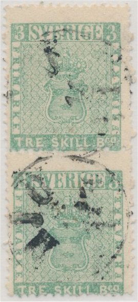
Tydligt rufftandat par / Miserable perforation, ex Benzinger and Järnum 
Pos 100 med 4 dubbeltänder / Pos 100 with 4 doubled teeth, ex Lennart Järnum 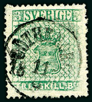
Upplappningsfel / Printing Plates unlevelled, ex David Feldman
Du måste vara inloggad för att kunna skicka en kommentar.